
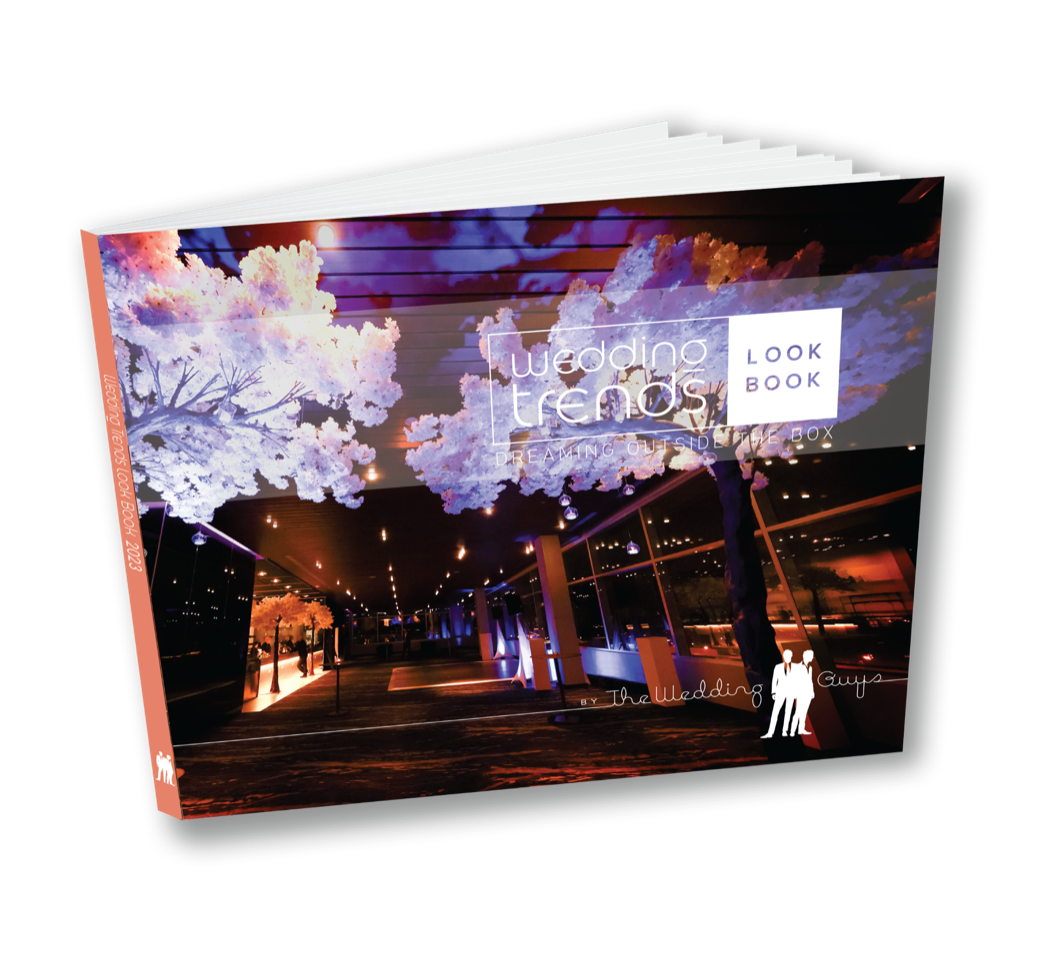
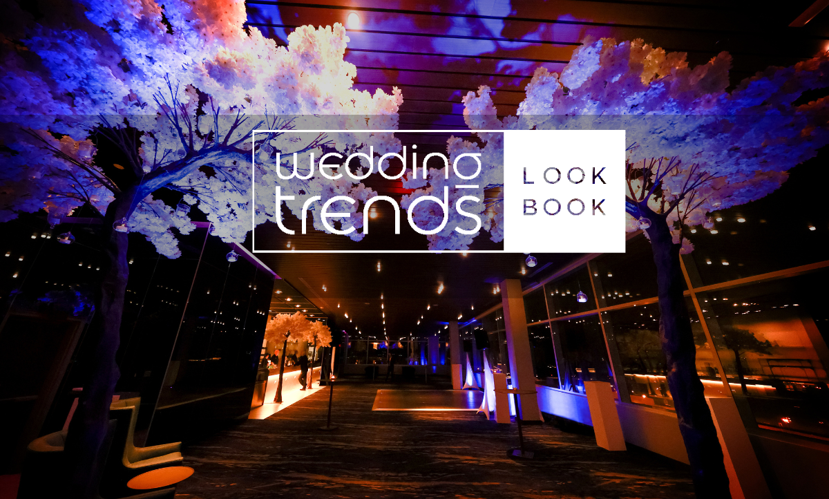
Each year, The Wedding Guys publishes the Wedding Trends Look Book to inspire you to dream of ways to create a...

On the hunt for a photographer to capture every detail? A venue with a view? A caterer with delectable eats? Featuring a collection of vetted Minnesota wedding professionals, our partners represent the area’s top wedding experts.
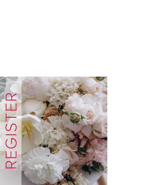
It’s time to define your wedding style. Join The Wedding Guys® community and be the first to discover:
This is the ONLY source you’ll need for tying the knot.
Looking for a photographer to capture every detail? A venue with a view? We’ve got you covered.
Featuring a collection of vetted local wedding professionals, our partners represent some of the area’s top wedding experts.
Wedding Guy
Matthew Trettel
Why trust The Wedding Guys?
I’ve spent 20 years crafting an innovative team to bring you all things Minnesota wedding planning. Here you will find the best local vendors, the latest trends, and the best tools to help you plan your big day.
Plus, we’ve got an incredible story; from the production of hit TV series including Say Yes to the Dress America and Randy to the Rescue to producing fashion shows for New York’s Bridal Fashion Week, we are your direct connection to so much more.
The Wedding Guys are here to delight and surprise you. So cheers to exploring all the blissful options for your wedding!
If you’re looking for the ultimate wedding planning tool, you’re in the right place. The Wedding Guys’ award-winning team not only produces elegant wedding shows, but we also seek out inspiration globally and bring it right to YOU.
We encourage our couples to dare to be bold by providing the right resources you need to turn your wedding dreams into reality. Your personal style will meet the latest wedding trends to create a perfect day that’s authentically YOU!
Dare to be bold and turn your wedding dreams into reality. Your personal style will meet the latest wedding trends to create a perfect day that’s authentically YOU!
Bringing global trends and inspiration right to your fingertips.
“How do I pick the perfect wedding party looks?”
“Where do I begin budgeting for my wedding?”
We answer all of your burning Minnesota wedding-planning questions and more right here on our blog!
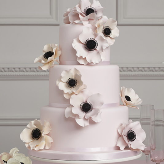
Wedding Trends Look Book Inspiration: Retro Revived
Each year, The Wedding Guys publishes the Wedding Trends Look Book to inspire you to dream of ways to create a...
Best Tips for Choosing Your Wedding Party
Believe it or not, choosing your wedding party is a lot like everything else in wedding planning: there are...
A Guide for How to Address Your Wedding Invitations
You’re creating your wedding guest list and it’s filled with your closest family and friends. Now that you’ve...
11 Wedding Rules to Always Follow
Long gone are the days of couples choosing to follow every wedding tradition, but there are still some...
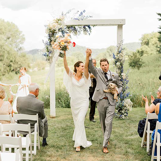
How to Incorporate Your Pet into Your Wedding Day
Studio Twelve:52 If you have a pet, they are a part of your family, and that means you probably want them...
Wedding Venue Checklist & Timeline
One of the very first tasks to complete as you begin wedding planning is to book your venue! Popular locations...